Senior Product Designer at nib. occassionaly like to dabble in development.
Senior Product Designer at nib. occassionaly like to dabble in development.
At nib, I own experimentation for the sales team. I identify what to test, design and code variants in Optimizely and React, and analyse results. I also standardised accessibility practices across the organisation, which led to an invitation to speak alongside Dylan Alcott on International Accessibility Day.
I've been integrating AI into my workflow since local LLMs became viable. I've built custom MCPs that connect models directly to design system documentation, and created an automated accessibility auditor that scans code against WCAG standards. I'm interested in how AI can remove friction from design operations, not replace the thinking.
Before nib, I spent four years at Greater Bank during their digital transformation. I designed the native iOS and Android experiences from scratch, built their first design system, and led the migration from Sketch to Figma. I also shipped a secure messaging feature that made a non-customer say, "I would change banks for this."
I think in systems, ship in code, and build tools when something's missing. I've mentored ~14 designers on experimentation and accessibility, pitched directly to divisional leadership to secure investment in design infrastructure, and collaborate regularly across disciplines: legal, content, marketing, design ops, and front-line staff.
My goal is to simplify complexity: take abstract problems and turn them into digestible parts that teams can act on. I draw connections across people, product, and process to create clarity, and I bring others along on that journey.
I think in first principles. I break problems down to their core before jumping into solutions.
I look for opportunities to help others grow. If something helps me, I find ways to share it. A process, a tool, a guild, whatever makes the knowledge stick.
I simplify to create clarity. Abstract problems become digestible parts that people can actually work with.
Accessibility matters to me. It's a culture, not a checklist. That's why I built Sa11y and started a11ycats.
University of Newcastle | 2019
Bachelor of Visual Communication Design
Graduated with Distinction

nib is one of Australia's fastest-growing health funds, offering health coverage to over 1,000,000 people nationwide. We also provide health insurance for international visitors and students coming to Australia.
As the sole designer on the Sales team, my responsibility was to enhance the usability of the sales funnels and ultimately increase overall sales.
The project started as a straightforward technical rebuild: migrate the International Workers Health Insurance funnel to Next.js and replicate what already existed. No scope for changes.
I saw this as a missed opportunity. I asked the product manager if there was a fixed deadline and whether we could use this rebuild as an opportunity to address known issues and refresh the design language. The answer was yes.
The original IWHI funnel (before redesign)
I dug into ContentSquare and past research. The existing funnel was built for users with high intent to join, which alienated anyone just shopping around for prices. There were significant drop-offs throughout, users looping back because key information wasn't persisted, and a mobile experience that was broken in places. The UI hadn't been updated in years.
I shaped a vision for the new funnel: simplify the visuals, improve content hierarchy, separate the quote experience from the join experience, and give users the context they need upfront. Transparency around pricing, clearer expectations, meaningful colour choices, and a responsive layout that actually works.
The redesigned IWHI product selection page
I also jumped into the codebase. The initial implementation was inconsistent, so I built a layout component to standardise the experience across pages and worked through the funnel to align typography, colour, and responsiveness with the design system.
I advocated for a new carousel component, prototyped it on GitHub, and co-designed it with the design ops team to get it into the Mesh design system. It's now part of the new funnel.
The project goes live after Christmas. Internal testing has been well received, accessibility feedback from users with lived experiences has been positive, and we've validated key assumptions by running experiments in the existing funnel and carrying those insights forward.
Internal offer management dashboard
The operations team was losing months each year to a manual, fragmented process for creating and fulfilling offers, relying on legacy tools that delayed marketing campaigns and introduced errors.
I designed a modern interface in close collaboration with the marketing team, running regular feedback sessions to ensure we were solving the right problems. I shaped the frontend architecture to simplify backend integration, and contributed production React code to hit a tight deadline.
Offer creation dropped from weeks to minutes. Near-zero error rates. Roughly two months of labour saved annually.
One thing that stuck with me, using a "best, better, good" framework made prioritisation conversations with stakeholders far easier, it helped everyone see the tradeoffs between ideal and MVP.
When the experimentation team was disbanded, ownership of Optimizely transferred to my team. Before taking it on, I sat down with the outgoing team to understand what worked, what didn't, and where the pain points were. The biggest issue was that velocity experiments took too long to plan, run, and learn from.
Lean experimentation process overview
I built a lean experimentation process designed for speed: identify issues through data (ContentSquare, Google Analytics), form a testable hypothesis tied to a business outcome, design and develop variants, and run. I handle the full end-to-end from analysis through to building variants in Optimizely using HTML, CSS, and JavaScript, or routing directly in React.
One experiment stands out: I noticed high bounce rates and low scroll depth on our quote funnel entry point. My hypothesis was that the value exchange wasn't clear enough and users saw too many fields before seeing products. I designed variations that addressed this. The result was 13% more users reaching the quote stage.

Data analysis using ContentSquare
Demo of an experimentation variant in Optimizely
The process I created has since been adopted by other teams across the division similar to the accessibility playbook, it gave people a framework they could run with independently.
Not every experiment wins. I redesigned our product cards based on solid design rationale, but it underperformed users were more attached to the familiar layout than I expected. That's the point though: experimentation lets you test assumptions cheaply before committing engineering effort to something that might not move the needle.
One shift I pushed for was rethinking how we pick metrics. The previous approach often measured vanity metrics clicks on a button, for example rather than outcomes that matter to the business. I introduced proxy metrics tied to conversion, so even when we can't measure the final outcome directly, we're still learning something meaningful.
Accessibility at nib was reactive—no standardised auditing, no measurement, no consistent process. This became a real problem when partner inquiries about compliance revealed gaps that put commercial relationships at risk.
The internal Accessibility Playbook site
I built an internal Playbook site with video tutorials and a clear framework teams could actually follow. To scale it, I launched a11ycats—an internal guild—and ran a company-wide roadshow to train teams on integrating accessibility into their workflow, not just tacking it on at the end.
Multiple product teams now use the playbook as part of their process. I was invited to speak alongside Dylan Alcott on International Accessibility Day to share what we'd built.
International Accessibility Day presentation alongside Dylan Alcott
The biggest shift wasn't tooling—it was culture. Accessibility became a conversation, not a checkbox.

Greater Bank is a customer-owned banking institution serving over 170,000 customers across New South Wales. As a customer-owned bank, Greater Bank focuses on delivering personalized service and competitive financial products to local communities.
As UX Designer, I was responsible for reimagining the digital banking experience across web and mobile platforms, ensuring accessibility and ease of use for all customers.
When COVID hit and branches started closing, Greater Bank needed a way to bring its signature in-person service into the app. The board had been watching neobanks closely—but we weren't trying to copy them. We wanted to translate the trust and conversational tone that Greater was known for into a digital experience.

Sitting with frontline staff to understand call centre customer service
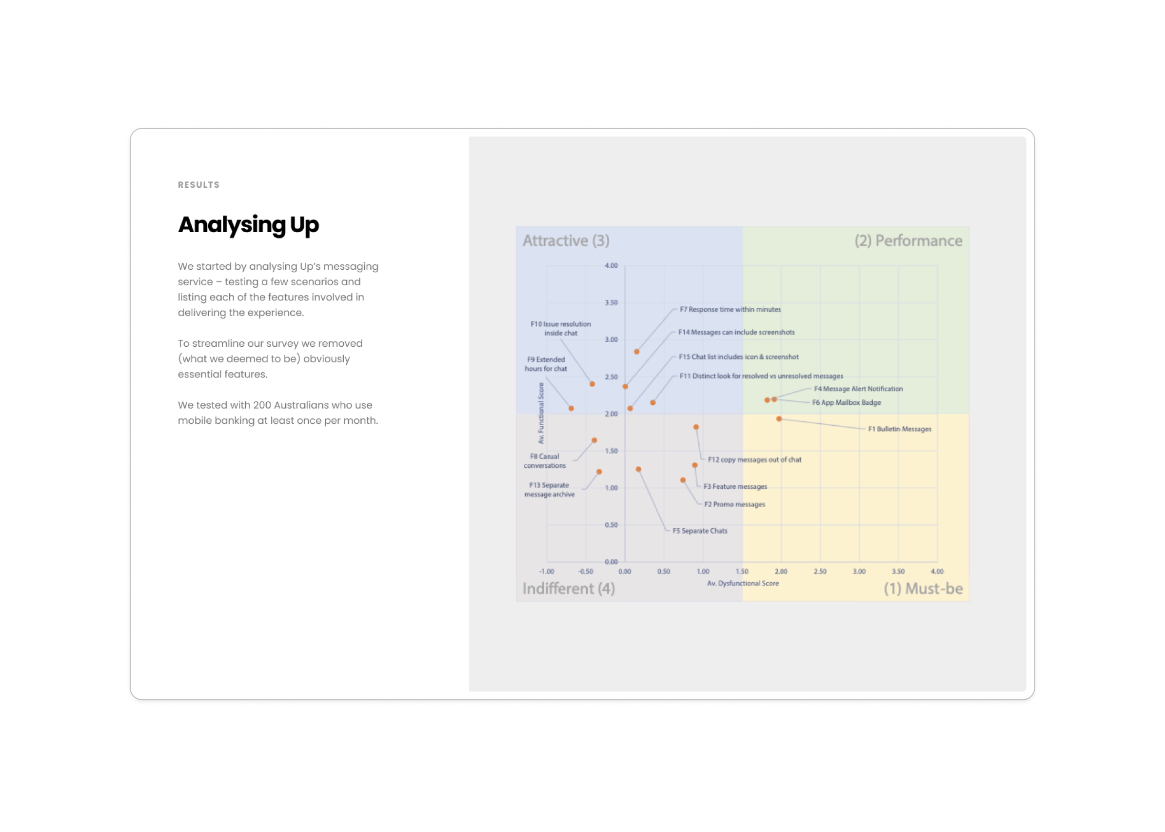
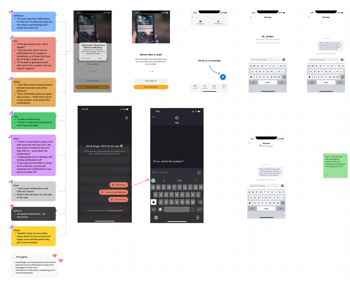
I was the sole designer on a team of four engineers, a product manager, a business analyst, and a senior researcher. We started broad: a customer survey to understand which in-branch tasks people felt comfortable doing online, followed by staff interviews to learn how frontline workers actually built trust with customers. We assessed competitor messaging features using the Kano model and tested those findings with over 100 non-Greater customers.
Kano Model analysis of messaging features
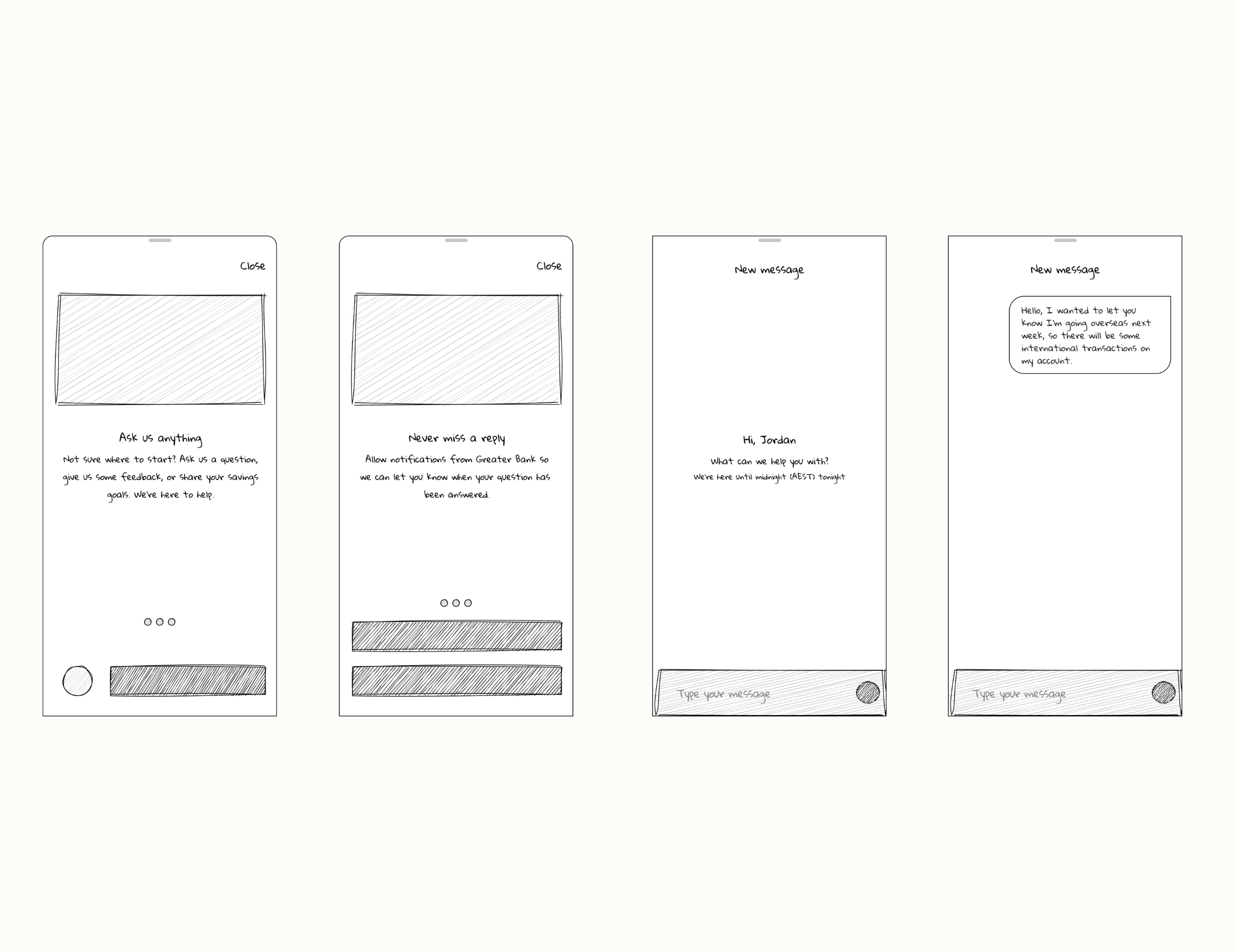
From there, I prototyped a direction and tested it with 8 users to validate our assumptions around the core experience—things like initiating a conversation, response expectations, and feeling supported.
The biggest constraint was technical: we were integrating with Genesis, a third-party system, and needed the experience to feel cohesive across iOS, Android, and web despite platform differences. A lot of my work was figuring out how to maintain consistency without forcing sameness.
ios implimentation
"I would change banks for this" — feedback from a non-Greater customer during testing. It validated that we weren't just solving a logistics problem; we'd created something people genuinely wanted.
This project shaped how I think about translating physical experiences into digital ones—starting with the people who deliver the service, not just the people who use it.
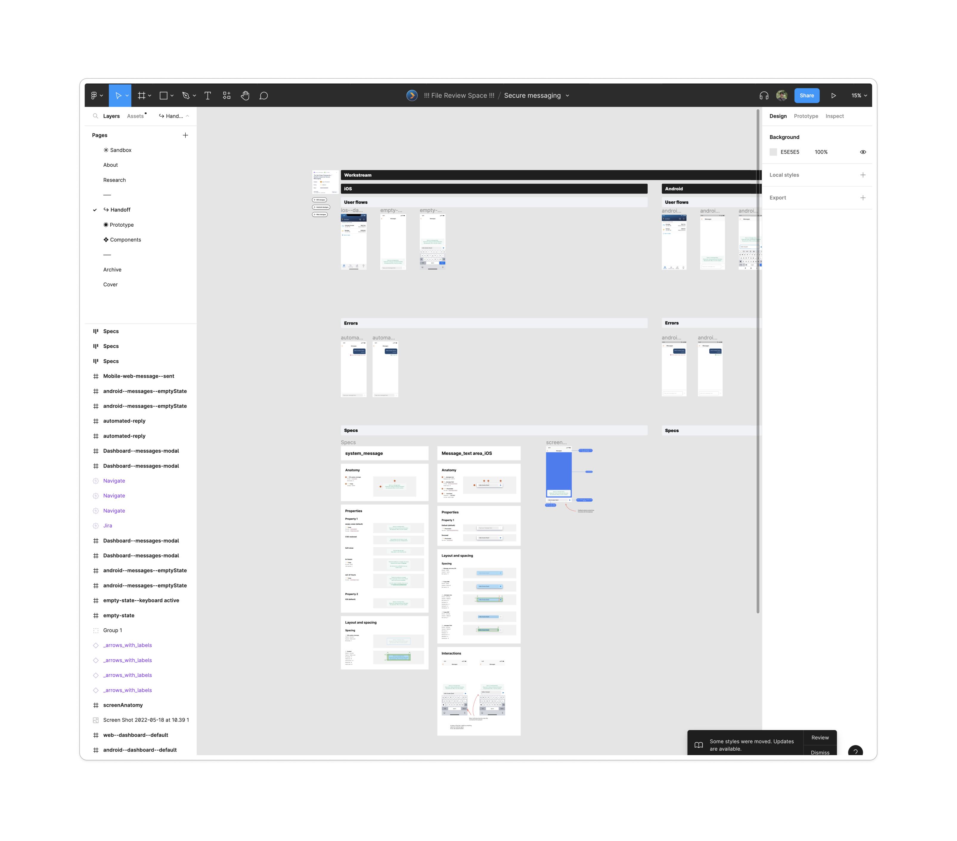
Secure messaging case study board
When I joined Greater Bank, design lived in Sketch with a painful check-in/check-out process—no cloud collaboration, constant version conflicts, and non-designers completely locked out. I'd been watching Figma since it launched and saw an opportunity.
I proposed a one-month pilot: I'd work exclusively in Figma with my product team, developers, researchers, and content designers, then report back with findings. The result was a resounding yes—collaboration improved immediately, friction dropped, and the only real pain point (converting Sketch files) was already solved by Figma's import tool. We made the switch.
Friction points before figma
The design system grew alongside this. Initially it was a side project—no formal buy-in, just something we maintained because it made our work faster. That changed when a merger was announced and we'd need to support multiple brands.
I saw the opening. The executive of our digital transformation division asked for a business case they could take to the board. I built one: an accessibility-first, iterative design system grounded in best practices I'd gathered from reaching out to design ops people in the community, including folks at Figma. It got sign-off.
Design systems pitch deck prototype
I also created a pitch deck to communicate the value to teams across the division—what a design system is, how it would help velocity, why it mattered. It built momentum.
The constraint was resources: no dedicated team, so it had to be built alongside other work. I evaluated tools and landed on Supernova because it worked with Style Dictionary, allowing design tokens to flow into iOS, Android, and web through a single source of truth.
Greater Bank Stacks design system documentation landing page
The V1 included foundational styles (colour, typography, iconography), base components for iOS, Android, and web, accessibility guidelines, content principles, and coded examples in Storybook. It was comprehensive—not a component library, but a proper system.
All four squads in the division adopted it. Developers saw roughly 40% faster build times by reusing components instead of rebuilding from scratch. Designers stopped spending days recreating the same patterns. Beyond velocity, it brought cohesion—a single source of truth that aligned teams who'd previously been working in silos.
Android UI kit
Check out the refined UI kit here
I handed it off when I left Greater Bank, passing it to the team overseeing the merger to scale across brands.

The University of Newcastle is a public research university serving over 37,000 students across multiple campuses in New South Wales. As a student designer, I worked on various projects that supported the university's digital presence and student experience initiatives.
During my time at the university, I collaborated with various departments to create digital solutions that improved student engagement and streamlined administrative processes.
The existing student portal was fragmented across multiple systems, creating confusion for students trying to access essential services like enrollment, timetables, and academic records. Students were spending excessive time navigating between different platforms to complete basic tasks.

The redesigned student portal dashboard
I conducted user research with students across different faculties to understand their primary needs and pain points. Based on these insights, I designed a unified portal interface that consolidated key services into a single, intuitive dashboard.
The redesign focused on reducing cognitive load by grouping related functions together and providing clear visual hierarchy. I worked closely with the development team to ensure the design was technically feasible within the existing university systems.
User testing showed a 35% reduction in time spent navigating to key services, and student satisfaction scores improved significantly. The new portal became the foundation for future student experience improvements.
An AI-powered accessibility auditor that scans code against WCAG standards.
I wanted to integrate accessibility checks directly into the QA workflow rather than treating it as an afterthought. a11ycat uses a custom Model Context Protocol to connect an LLM to WCAG documentation, then scans code and flags issues with plain-language explanations.
a11ycat AI accessibility auditing demo
Part of my broader exploration into how AI can remove friction from design operations without replacing the thinking.
Tools I've built to reduce friction and speed up design workflows.
Standardises file organisation to reduce developer handoff friction and improve discoverability. Built with TypeScript and React.
DesignSync plugin workflow demonstration
Generates key UI patterns instantly to accelerate prototyping for the wider design team.
Playbook plugin generating UI patterns
A reference for designing with Apple's Dynamic Type system. Helps designers understand how text scales across accessibility sizes.
iOS Dynamic Type Scale reference tool
We conducted call center interviews with a rough concept pitch. Key insights:
We evaluated neo-bank chat features with 20+ mobile banking users. Key insights:
These insights shaped a clear direction: A secure, human-first messaging channel, not an overly "chatty" or automated one.
We ran a customer survey to understand which banking tasks users were comfortable handling online. Findings showed customers were open to managing simple requests digitally (card limits, travel notices) but needed reassurance around security for sensitive tasks.
Instead of only auditing banking apps, I broadened research to messaging platforms like Reddit, KakaoTalk, and LINE. Using Jakob's Law, I identified familiar interaction patterns to reduce cognitive load.
Using insights from staff interviews, we mapped common support tasks such as dispute handling and escalations, identifying critical touchpoints.
Created low-fidelity wireframes based on journey maps, ran internal reviews with PM, BA, and compliance, and developed a clickable prototype for testing. This iterative loop ensured feasibility and usability early.
While working at Greater Bank, I had the opportunity to learn about iOS development and explore the accessibility features in iPhones, particularly around dynamic type.
This project provides designers and developers with a comprehensive reference for implementing dynamic type in iOS applications, ensuring accessibility for all users.
A complete reference guide for iOS dynamic type scales, helping teams design and build accessible interfaces that adapt to user preferences.
This resource has been widely adopted by the design community, helping teams build more accessible iOS applications.
Check it out on the Figma community page
A comprehensive Figma plugin designed to streamline design workflows and improve team collaboration through automated design system management.
This tool helps design teams maintain consistency across their products by providing quick access to design patterns, components, and best practices directly within Figma.
The plugin will offer a range of features to help teams work more efficiently and maintain design consistency.
This project is currently in active development. More details and a public release will be announced soon.
A web accessibility tool that translates WCAG guidelines into plain language.
I built Sa11y because accessibility auditing is intimidating for non-experts. Most tools assume you already understand WCAG. Sa11y explains what's wrong and why it matters in terms anyone can follow.
The Sa11y accessibility auditing tool interface
The site itself is built to model best-in-class accessibility standards: semantic HTML, clear hierarchy, and tested against the same criteria it checks for.
© lukeylias